STAPLES
Staples.com redesign
The Staples.com Home Page Redesign project was initiated to give the site an updated design and improve navigation to make it easier for customers to browse, research and buy a wide range of business products and services and gather information on the site. The redesign’s goal was to increase conversion and its guiding principles were to operate as a portal into the rest of the website, highlight key information, exhibit a logical, organized, and modern display, continue to meet the needs of our core customer along with enhancing the experience for all Staples personas
The new Home Page design was tested through Site Spec (A/B testing) with 2% of the traffic, and there was a .5% increase in sales which resulted in an estimated $6M annual increase in sales.
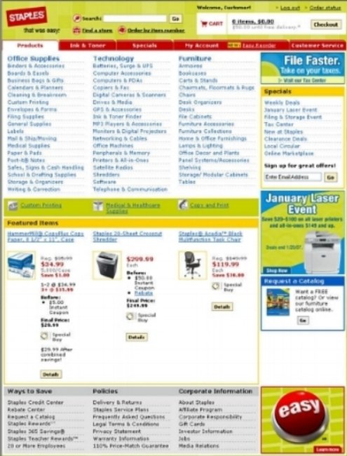
Staples.com home page - Old version

Staples.com home page - New version
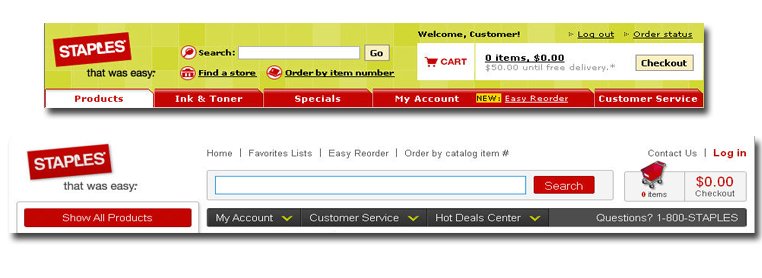
Staples.com home page - Old vs. New header
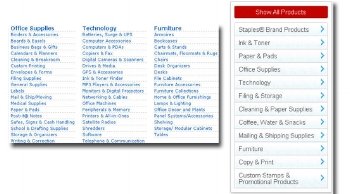
Staples.com home page - Improved categorization
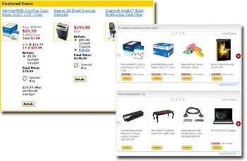
Staples.com home page - Targeted personalized offers
SKU page redesign
The overall goal of this project was to transition to 1024 x 768 screen resolution, improve the readability of the page by enhancing the cross sell and up sell modules and product content, adding new promotional functionality and creating locations for both enhanced product images and store inventory lookup. It also involved the creation of a retail-only SKU page which included most of the same information as a delivery SKU but the page did not include an Add to Cart button
Success criteria was determined by an improvement in conversion rates, increase in Bizrate score for ‘Clarity of Product Info’ and improvement in CSAT scores for ‘Ease of Finding Products’ and ‘Clarity of Promotional Offers’.
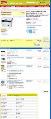
SKU page - Old design
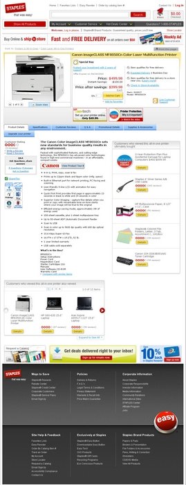
SKU page - New design

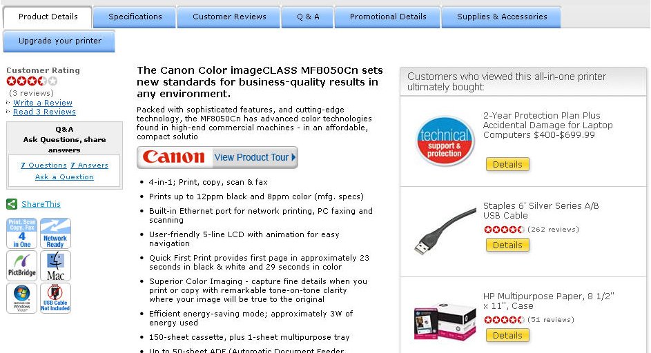
SKU page - Enhanced images and store availability check
SKU Page: Revised Content Layout and Cross-sell Modules

SKU Page: Enhanced Up-sell Module

SKU Page: Store Inventory Lookup
Checkout and Ship-to-store
The primary objective of reworking the checkout flow on Staples.com was to reduce the abandonment rate and consequently to increase conversion. In addition to reorganizing the flow from the existing functionality it also included incremental improvements like:
Introduction of guest checkout and ship-to-store capability.
Improved error handling for delivery address validation.
Eliminated the requirement to apply a method of payment to the order before reviewing the order contents and final cost.
The redesigned Staples.com checkout flow reduces the number of steps a customer must complete in order to submit their order from 5 to 2 screens. It also accomplished several other goals:
Integrated new customer registration into the checkout flow.
Enabled a systemic process for customers to request that an order is delivered to a local Staples retail store instead of a customer address.
Enabled guest checkout whereby a customer can submit an order without creating a user name and password.
Improved address error handling to allow a customer to explicitly accept or override a city, state, and zip code combination suggested by Postal soft.
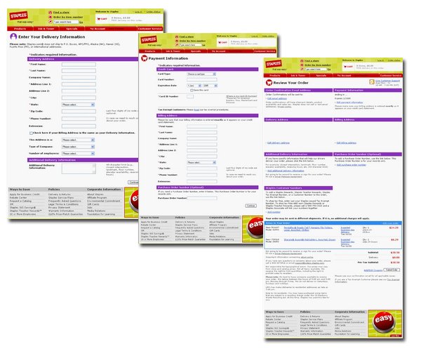
Checkout and Ship-to-store: Old Design
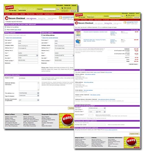
Checkout and Ship-to-store: New Design

Ship-to-store functionality during checkout